ManageEngine recently released ServiceDesk Plus 9. While they have implemented most requested features, user interface was left unchanged. When Microsoft releases new Windows version, UI is always changed or improved. That is not the case with SDP. While I am a bit critical about new features, that is mainly because I am an avid SDP user. We use enterprise version and it’s features. I admit I like it. We set it up internally, by our self. We could have used ME support. They are available. We chose to set it up, to learn about it.
There are couple of features that I miss. Features that would make my job easier. That’s why there is such a disappointment. I was contacted by ME team who told me that they understand my problems and that they are working on it. They are doing all they can, working after hours just so that people like me would be better served. ME understands end users. They are end users of their product them self. 3 Years ago I was assigned to Internet store project. While time flew by, it was like days for us. People kept asking us, when will it launch… And we all said when it’s ready. End users don’t know and understand what’s going on in the background with development. I can be critical as much as I want, but that doesn’t mean that they don’t work on UI redesign. I don’t know if they are working on new design. I don’t know if new design will be out in one year, two years…But…
I have great news. I saw new beta version and can confirm that ME is hard at work and it shows. They are in the final beta stage with the redesign. UI is modern with newest technologies onboard. SDP is improved in a way that what you know, will be the same only with improved workflow and better design. Think improvement from Windows XP to Windows 7. ManageEngine ServiceDesk Plus UI update prepare to be blown away by the great design, new features and new technology.
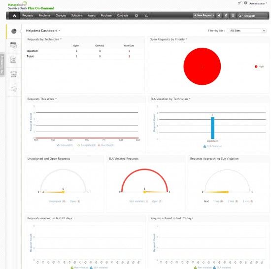
Dashboard is similar to what you know, yet so much better, if you are already SDP user, you will feel at home.
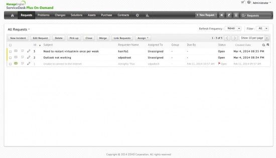
Incidents view is improved and not crowded.
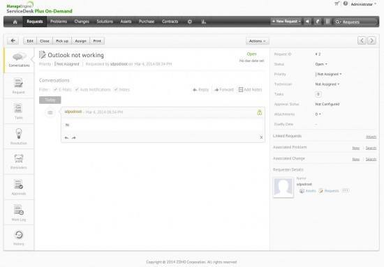
When you open incident you will see biggest improvement. On the left side, there is a ”quick menu” new feature that makes it easier to review the incident. On the right side you have an incident information, you can also link requests, associate problems and change.
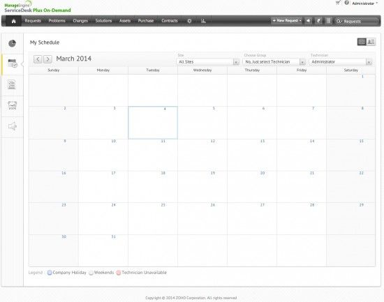
Scheduler view.
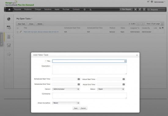
Tasks is also improved, now when you see a dialogue open, a background is slightly faded to put a focus on open dialogue.
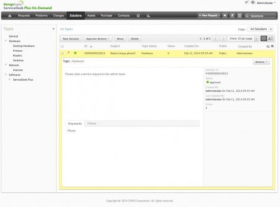
Solutions view is also changed in a way that it’s very similar, but it is easier to navigate and understand.
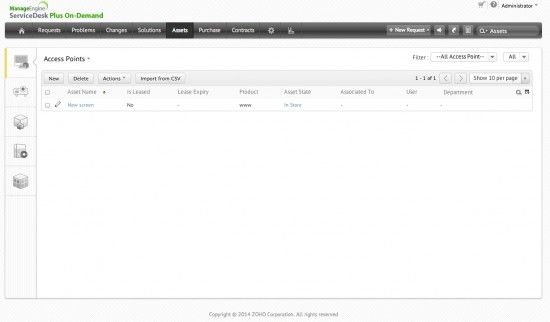
Inventory view
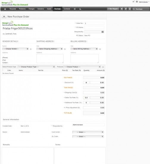
I was also surprised when I opened Purchase module. Nice.
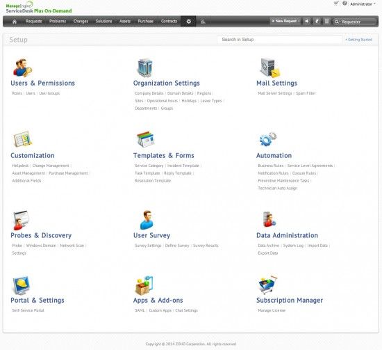
Setup now no longer feels crowded and frightening.
I am very impressed by the progress ME did from the first draft. Not only UI feels faster and better looking, it also includes improvements like drag and drop. I hope they will fix my gripes and will release it in one of the point releases. My confidence is back. Thank you.
Good work guys.
(update – it’s been more than a year. There is still no update…)


What about release date of new UI ?
I don’t know. I would assume that within a year.
Hi Sasha,
I got information from ME that new UI launch is very close for SaaS version. Later on On premise overhaul will follow.
Good news … but we use on-demand version 🙂
Well, as to this day, nothing of what was announced a year ago, has been delivered! And if my information is correct, even the SaaS version is not updated yet with the new UI. By the way, there is not only the ‘new UI’, which seems limited throughout the application so far (incidents). But there’s also much need for a new editor, a overhauled purchasing request module, and a bit more that has been announced.