My father (67 ) and father in law (69 ) are both computer enthusiasts who share this passion for gadgets, computers and new technology. Father in law had this really old computer, so the family decided to buy him Windows 7 64 bit for his birthday . He was extremely happy , telling us how great the system was and what kind of technology was implemented. Two years later his computer broke down and it was time to buy a new one.
His first reaction was a thorough research by brand, screen size, cpu, ram, etc. He finally chose a computer with Windows 8 pre-installed, claiming that even his wife, who rarely uses computer, will find this version more appealing ,due to the “amazing start screen”.
So this is how their conversation unfolded….
Then Father in law said” Wait a minute, you’ve got a Mac, don’t you ? Have you upgraded it with the OS X Mavericks ?“ Father said: “Yes, I have, and guess what, now it’s free and it’s nothing special”. And that got me thinking. My father has used Mac for some time, from version 9 to be precise. He has updated the system, never missed a release. When OS X came out he bought new computer and from then on, I don’t ever remember rumbling him about any version that “sucked”. I asked several designers where I work, what they feel of about new OS X release. Some were still using the version that came with the computer, some have updated it to the latest release. Some were on 10.8 and others were still on 10.6.8. Eventually they will all update it but they are still waiting for bugs to be fixed, like they’ve done with every release.When asked what they liked about the new features in OS X releases they all mentioned consistency and small improvements. I won’t go into technology behind each platform but what matters is that Mac users don’t rant about problems regarding OS – UI . Sure, there is a bug or two in every new version, there are firmware problems with new MacBook models, but in general Apple either fixes the problems or replaces a computer if they can’t fixed it via firmware update.
Let’s start by comparing Microsoft Windows and Apple OS.
We return to year 19 , that was the year when windows was at version 2.11 and OS 7 was at version 7 Mac OS 7,
Let’s take a quick look at Mac OS history – UI. Let’s take a quick look at usability. We’ll fast forward and check just a compare few OS releases. The most fascinating thing about it is that the Apple OS UI has hardly changed.
Apple OS quick UI review
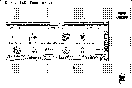
Mac OS 6, there is menu at the top and icons on the desktop are on the right side. Looking at this screenshot, you can find similarities with the most recent version of OS X
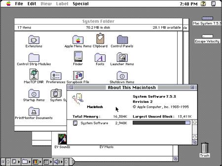
Mac OS 7.5.3, With one of the revisions to Mac OS 7, Apple added colors, OS X dock predecessor introduced, no major changes to UI
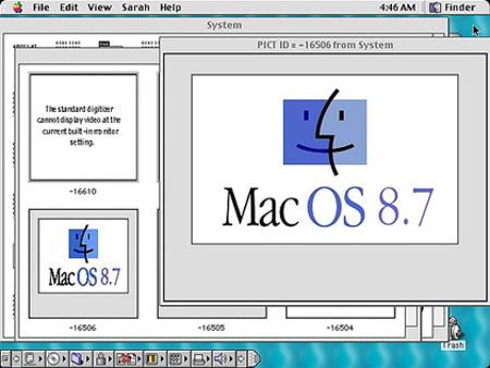
Mac OS 8.7, tweaked UI, but still the same outlook.
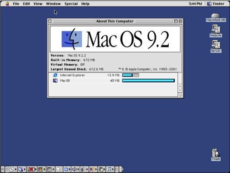
Mac OS 9.2, UI refinement
Mac OS X,
Apple introduced a revolutionary interface called Aqua, featuring elements in interface, including transparency, that were way beyond anything at that time. If you look at the screenshot, you will notice that they kept all the elementary characteristics, i.e. menu at the top, icons on the right, an improved dock was at the bottom. Comparing OS X with Os 754 they are still very much alike.
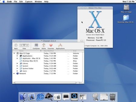
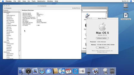
Mac OS X 10.4, no major differences, UI refinements
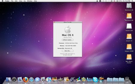
Mac OSX 10.6, no major differences in UI, except for „3D dock“ and new Icons
Mac OS X 10.9 Mavericks – again no major changes to the UI
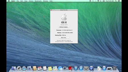
Perhaps the biggest change all Mac OS releases have in common is default wallpaper. Wallpaper is new in every release.
Next page: Microsoft Windows quick UI review
Microsoft Windows quick UI review
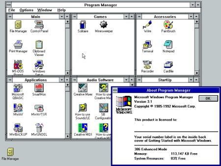
Windows 3.1, Program Manager was the basis of graphical interface.
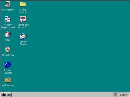
Windows 95, Microsoft changed UI completely, featured Start button and task bar.
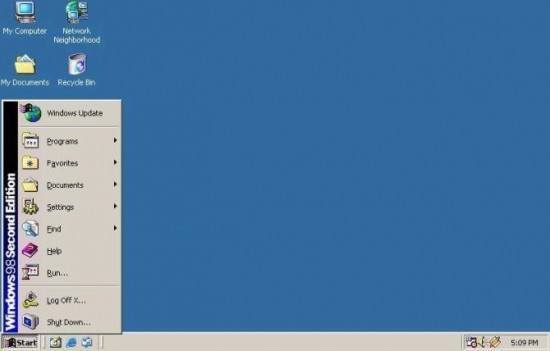
Windows 98, ME, 2000 all featured enhanced GUI based on Windows 95, biggest changes being icons, colours of background and task bar refinement.
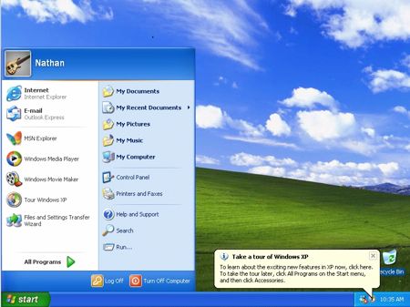
Windows XP, released in 2001, featured Luna – mostly blue UI, redesigned Start menu and new icons. That was a big change for Windows at that time. I still remember how we were deciding whether to include new or old start menu in to the corporate image. People were complaining about new start menu and about blue colours. After a while they got used to it. Another change that was also quite annoying was Control panel, web-based interface that would make experience better, but in fact it made it worse. Thinking about it, I just remembered that there were a lot of Linux distributions that were copying Windows Explorer & Control Panel in that time.
Windows Vista was the opposite of Windows XP, where XP wanted to be cool with blue colours Vista went with black is the new white mantra. But that was not the only thing that has changed, Control panel was redesigned and so was access to various tools such as network connections. IT folk I spoke with, were quite frustrated they didn’t like the change, but they would get used to it eventually, if Vista was successful.
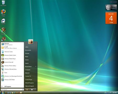
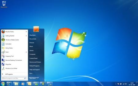
Windows 7, where Windows Vista failed, Windows 7 improved and was cited as the best Windows release ever. All that was wrong with Vista, Microsoft fixed. They improved task bar with dock like functionality. They have added various effects like Aero Snap. But they also removed certain features such as – Classic start menu was gone, so was Quick Launch and several other features that were present in Vista no longer existed. But when people got used to it they were fine.
Windows 8, now this is a big change. What were Microsoft designers drinking when deciding a fate for Windows 8 GUI – is beyond me. Windows 8 was supposed to be great for Tablets, but someone forgot about Desktop users. Not only was there a change in UI elements but also shift in paradigm, how the user interacts with the GUI. Metro which was the code name for the user interface was badly accepted by the end users. And even though Windows 8 had great improvements under the hood people just didn’t care. Luckily, start button replacement programs start appearing that made experience very similar to Windows 7. When I tried Windows 8, my first reaction was, hey, wait a minute, I won’t spend 20 – 60 minutes just to learn how to use the system. I didn’t have the time or will to give in. There wasn’t any benefit. My friend on the other hand did use new start screen for a while, the only one I know, and he liked it. But guess what, he installed Start button replacement after 2 months. Also, metro applications being opened in full screen don’t work on desktop computer well.
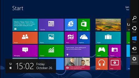
Now imagine my father in law being used to one paradigm most of his life and then suddenly, all the knowledge he accumulated about the windows was gone. He was very frustrated, that’s why he returned the new computer and replaced it with one that had Windows 7 pre-installed. So much about Windows 8 and easy to use mantra.
And I can also understand why my father found it strange that somebody would buy a book explaining the new OS version. He never had to, since OS X UI has never drastically changed. Why would you change something that works anyway?
Why do Mac users don’t rant about the OS?
Because changes that are implemented in the GUI are just a refinement, improvement with all the settings and applications waiting for them in the same place with the same or improved GUI. They feel … at home. When Steve Jobs took over Apple in 1997, he could have changed GUI of the system , later known as OS X, to be more like NEXTSTEP , another creation of his. But he decided not to and that is the reason Mac users love their Mac and its OS.
Apple advantage is that they perfect a product and they only improve it through the time. Look at Mac OS 6 and compare it to OS X 10.9, what about experience. Very similar. Now do the same with Windows 3.1 and Windows 8.
If you like, you can go back in time and experience Mac OS 7 in a web browser here


Napsat komentář